Sunday, August 19, 2012

Bouncing Baby Boyn

Life has been keeping me a bit busy of late. Not with huge and taxing things like "Move House" or "Build Moon Rocket", but with small things that add up, like "Play with Son" (He needs it more than usual right now since his best friend just moved away), "Ensure kittens aren't eating power cables" (We just got two kittens - I think I mentioned this last post) and "Paint a baby" (which this post is about, eventually).

Usually I manage to cram in some video game playing, some TV watching, some sketching and some reading into an average evening. Maybe not all of those things in one evening, but averaged across the week; with some speedpainting on the weekends. Right now this is not the case. I've played for 6 hours since the middle of July, I've managed an hour of TV a night (tops), I've spent a fortnight reading the same book (I usually finish them in 3 days) and this month so far I've done a bare two pages of sketching and not done a speedpaint for two weeks.

Those little things eat up a colossal amount of time I guess. Anyway, Onto the baby!


And there we go. You probably want some backstory and progress pictures. Or if you don't want them you at least expect them by now. You will not be left disappointed.

So a friend from work (We'll call him Mr. Boyn) approaches me ages ago and asks if I'll paint his son for him. Sure, why not, I'm on a roll with this whole commission thing anyway, right? Well, then things got busy and I forgot he'd asked. I even decided not to take any more commissions and posted about it here. The next day he said "does that include mine?" and I was all "of course not," because that wouldn't be very fair since my forgetting wasn't his fault. Contracts signed, reference picture handed over, start painting in time for his Son's first birthday (the painting is actually for his wife though).


The initial sketch bears only a passing resemblance to his son because I was planning on painting over it, so I just needed the basic location and scale of his features (I got the eyes very wrong, more on that in a sec). I used a grid, but by "grid" I mean "crosshair", you can see it in the picture. Not great for extreme accuracy, but it did the job in this case.

Then I started painting, and pretty quickly realised I was painting too dark. You can see the bottom two pics getting lighter as I over paint it (I cheated for his T-shirt and ear though and just adjusted the levels. I'll try and live with my guilt).

It was around this point that I also realised I'd made his eyes too small, resulting him looking sort of piggish, and rather sinister. First I opened them up a bit, and then just repainted them larger, and continued to tweak them a few times until he looked happy and cute (as they are int he reference). In the bottom right image I've also tweaked the lighting on his cheek and blocked in his mouth. Mr. Boyn approved of the progress.


You'll note that the images get lighter as we go along. This is because every time I left it and came back I'd be amazed at how dark I'd painted it last time and then lighten it up a bit. The exception is his pupils which I painted too light in the top left image and then had to darken a little. Then I moved onto his T-shirt in the top right.

His actual shirt had snoopy on it, and I thought it would be nice to remove snoopy and leave him with a classy white. I wish I'd kept snoopy as keeping him wouldn't have been that hard and I could have hidden a lot of the wrinkles in the black parts. I'm kidding, but painting the T-shirt plain white was a lot harder than I expected, especially as I was leaving details out.

Bottom left I realised his mouth was a little wrong and his nose to small so I fixed them. You can barely tell can you? It was a little more noticeable full size so I think it was worth fixing. I then went back and finished his T-Shirt and added his shorts and hair (which went more smootly than I was expecting). Originally I was just going to leave the bottom black as his shorts were so dark, but once I finished his shirt it became obvious that I would need to add them. They weren't in the sketch though, so I just freestyled it. They came out quite well given they took less time than any other element in the painting.

After that it was just a case of blending the background colours, tweaking the shadows, painting his right arm (our left) and adding some knitted texture to the blue blanked to his left (our right). Oh, and painting his ear, which I almost forgot about so it was just sitting there unfinished almost until the last minute.

I changed very little from the original photo during painting. I mentioned I removed snoopy, and the only other major changes were changing the multiple shades of the blanket to flat blue, and increasing the amount of bounce light from it onto Boyn Jr. I think it went extremely smoothly overall, and while I'm not 100% satisfied (am I ever) it's a good likeness and he doesn't look creepy, which is what can easily happen in paintings of young children in my experience. For the record I was lucky in the photo I was given to begin with - their son is honestly adorable.

Were they happy with the result? I'm guessing yes as Mrs. Boyn has been quoted as being "speechless". I'm going to assume that means she liked it, rather than she couldn't think of anything nasty enough to say about it :)

No reference image for you (I forgot to ask permission) and no animated gif this time either as I didn't save all that many revisions for this one (They're almost all shown above).  So, apologies for that, but I'm sure you'll live.

Tuesday, August 14, 2012

The Best and Worst Sketching of July

Life's funny, full of little jokes. After my last post saying I wouldn't be taking any commissions for a while I remembered I'd already told someone I would do one for them. So I had to do that one obviously. That's done, and there should be a post about it this coming weekend. So with that out of the way I renewed my vow, and then had an offer I couldn't refuse, so I'm probably doing another. You won't hear more about that one for a while, but really I quite literally could not refuse it without kicking myself later.

So with all that going on, as well as other things (New kittens in the house, son being sad because his best friend's moved to Canada, wife starting college in a week etc) I've barely done any sketching so far this month. Luckily last month I was a mite more productive...


Free Sketching

I'm really going to try and get through this one with a minimum of writing, honestly (TOO LATE!), but I think I should point out the ones I really quite like. The Two guys to the left of the Troll (lower left) came out pretty well, as did the guy to their upper right (past the sketchy woman). The girl almost in the middle, who's darker than those surrounding her is pretty good too (and done in Charcoal for a change), while the rest are varying states of "not terrible".


Figure and Perspective Practice

Nothing outstanding here, but some fairly solid ones. I'm quite pleased with the poses on the guy and the girl (and the dog) in the top right corner, as well as the bowing figure below them. There's also a quite dynamic looking figure over on the left hand side; very sketchy, but I like the weight and balance of it. Have I mentioned recently that I don't copy these from other pictures? I think I need to reiterate it on occasion for people who don't regularly read the blog. Sometimes they're based on the memory of a picture, but usually they're just made up. Same with the free sketching.


From Reference

These on the other hand are most definitely based on photos. The two girls were based on a couple of thumbnails on pinterest, the headless chap in the middle is from some old photo of a bodybuilder back in the 1940's and in the lower right it's Jean Luc Picard (but not a very good one. Charcoal again though).

If you're wondering why some of the sketches look choppier than usual it might be down to the new scanner. It's a lot harder to clean up the general noise of the paper grain that it was on the old one, so some of them still have "dust" around them. It's pretty minor, but if you notice it that's why it's there.


Oh Dear

Okay, so I though this one came out really well, right up until I finished it and stood back.  At that point I gasped in horror because I'd buggered up her eye in the most amateurish way possible - one is far higher up than the other.  She's a Frankenstein's monster!  I did worse sketches in July, but this was far and away the most disappointing.  I've not even cleaned the image up all that much, so you get to see that paper grain I was talking about.  Blech!

And for this month that's all you're getting. The focus posts are probably moving to another post (at least this month they are), so watch out for that in a few days.

Oh, all right, have a bad sketch of one of the new kittens done in Sketchbook Pro (which I bought last week but have barely used).

Sunday, July 29, 2012

Pay No Attention to That Man Behind the Speedpaints

Back once more with the monthly speedpaint roundup. A little different this month, but we'll get to that in a minute. I decided at the Blog's birthday to try doing at least one speedpaint a week for the year, and so far I've managed to keep to that; so I have another four for you to see.

In other related news I'm taking a break from doing the commissions for a little bit in order to focus on improvement. People still want them, and I'd like to do them, but I feel bad taking peoples hard earned when there's improvement to be had (plus, they're a lot of work), so on with that for a few weeks before the money raking (hah!) can continue.

I've also co-started a group at work dedicated to that very improvement. I'm very happy with the response so far as we have artist and non artist alike all wanting to improve. We're not doing lessons and such (so far), it's more like a Weight Watchers type setup where we all admit that we suck and give each other support to improve. Expect to see some of my results appearing in the blog in future - right now I'm drawing a page of circles every night for two weeks, I'm sure you can hardly wait to gaze upon those those now can you?

OK, enough preamble...


Time Taken: 1 hour

My friend took a photo of these peaks in the Gower (look it up) with her phone and then posted it to friendface. Naturally I jumped on it immediately and, with her permission, painted it. It's not an exact copy, but it's close enough, and it's been a while since I've painted anything landscape like. If I'd spent about another hour on it it could have looked really good I think (not planning to though).


Time Taken: 35 Minutes

San Diego Comic Con was this month, and appearing on the floor were the three trolls from The Hobbit which many people took photos of. I thought that might be fun to paint, so I had a go at it. For the fun of experimentation I used very thick paint (fake, in ArtRage, obviously) and a low load. The result isn't that great as just as I was getting into it something came up and I had to leave it and then I didn't get back to it in a timely manner. But I also grabbed this:


I realized that I could "rewind" the painting by using undo because ArtRage seems to have an infinite number of undo steps per session. I took the chance to do what I've rarely done before and grabbed some work in progress shots of a speedpaint. It's odd that these were saved after the fact, but nevertheless they give a little insight into my speedpainting process (Which I think varies a bit every time). I did this for the other paints this month too.


Time Taken: 45 Minutes

I guess I've had this flagged for painting for ages. It's based on Stock by the intriguingly named pretentioustwat on Deviantart. I was originally going to paint the whole thing, but after viewing it full size (which naturally didn't fit on the screen) I thought just this crop of it might work too. I also decided (experimenting again) to make dark blue the darkest it could go, rather than black. I quite like the result.


Which is not to say its as good as I would have liked. I messed up her hands something fierce, but I suppose it's good enough. 15 Minutes in I almost gave up on it as obviously no good could come of it, but I'm glad I kept on. Interestingly it was only when it was finished that I could take a step back and decide the lack of black (or at least near black) had worked. Until then I was convinced it would be far too obvious, but in the end result I don't think it is until you really take a good look at it.


Time Taken: 35 Minutes

This is by far my favorite paint of the month. It's far from perfect, but it has that loose look I really liked about the portrait of the man from the last speedpaint post, but with a more finished feel. It's loosely based on this photo, though I have no idea where that picture originates from unfortunately.

As an experiment I saved the undo series as a video and uploaded it. You don't get to see the actual settings used or the occasional mistakes I made (since they were undone during the process and therefor not recorded), but it's a lot less stressful than doing it real time (as I've done before).


And so there we have it for another month. I don't think I'll be posting progress pictures for speedpaints ever month, but if you think I should feel free to let me know. I'll may post them for paints I really like though, as that's possibly worth the effort.

Sunday, July 22, 2012

The Best and Worst Sketching of May and June

This one's rather late in coming, and for that I apologize (you're used to it by now I'm sure).

Since I last posted I've had another virus infect my machine, I've upgraded windows and re-installed twice (partly due to the virus), gone deaf in one ear due to allergies (which cleared up - but now it's happened to the other ear) and discovered my scanner no longer works (Windows 7 incompatible, there's nothing actually wrong with the scanner itself). There was probably some other stuff in there too, but if I don't remember it it's probably not important.

Thankfully I had the good sense to scan sketches before that first re-install, so I do in fact have something to show today.


 Figure and Perspective Practice

I really need to work on my anatomy properly soon (and I'm taking steps to make that more likely to happen - but more on that some other time). It's improving, and I have a general idea of it, but I regularly forget some of it when I most need to remember (mostly on arms) and other parts I have very little knowledge of at all (legs). Still, some of this turned out okay.

I particularly like how the girl in the lower middle turned out, as well as the guy in the upper right corner. Other than that, fairly average stuff.


Free Sketching

Lots of free sketching this time around - much more than I would have expected, but I guess if you post two months worth at once that's what you get.

Not much to comment on except that I think the sketches in #1 are far better than in #2. And yes, that is a chainsaw; it's a prelim for a work I'll probably never get around to painting (but there again, I might.

Focus Sketching

I didn't really have a focus during these two months, but I did draw more hands than usual. Many of them are attached to people and can be seen in the other images, but this is a small selection of free floating ones. Still bad, but improving.


Work From Reference

Not a great deal given the time period. I need to set some time aside to do this more often - they're rarely very large and don't tend to take long when they're at this level.

Anyway, I had a link to the image the first one is based on, but it got nuked by the virus. If I find it again I'll add the link here. The guy with the hair is based on this image by Random Acts

I don't recall where the other two came from, just random images on the web I think.


Oh Dear

And as usual I'm finishing on a low note with some of the worst (as in, most disappointing) sketching of the time period. I really don't have much to say about these - they sort of speak for themselves (admittedly spattering you with phlegm as they do so).

Anyway, hopefully less of a delay before the next post. I have some speedpaints lined up to show, and a new scanner is winging it's way across the country to me so I can scan this months sketches for next months post. Whoopie.

Tuesday, July 3, 2012

Children of the Apocalypse

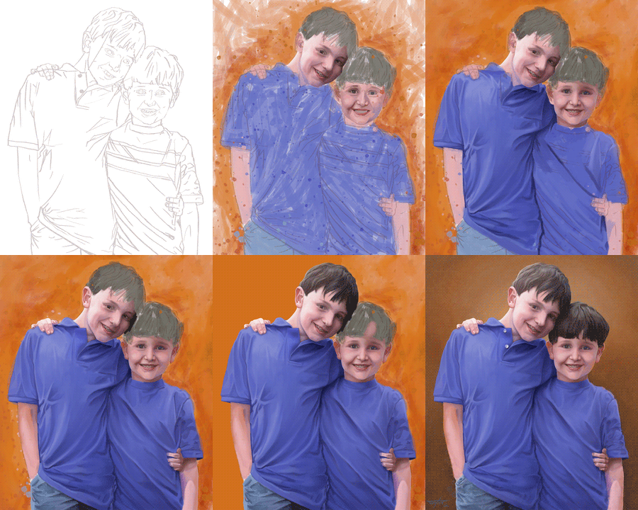
Despite the title of this post it should be noted that the two boys in the picture that follow are actually lovely lads.  The reason for the title is something that's not even apparent in the images, yet it's been the planned title ever since I got the commission for it back in April.

So why was it always the planned title?  Because the original brief required the two boys to be standing in front of a nuclear explosion with an innocent look on their face.  The idea was that they unintentionally bring chaos and destruction with them wherever they go.  They're boys, this is standard operating procedure :)

Okay, let's get to the chase and we can review afterwards.


Click to zoom, and so on....  Note the lack of an apocalyptic backdrop.

So I was at work one day and my colleague 'Z' comes by my desk.  I like Z, he's a good guy, with a laugh that's in the top three most awesome I've ever heard (and by far the loudest).  Despite this we work in very different areas, so for him to come by my desk is a rarity.  He cut straight to the chase, which is nice.

"Do you do commissions?"

"Not generally, but I could I guess" (This was before I got two others)

And so I got my first paying gig as a 'painter'.  Cool. I explained that I could only do digital (I can do real media of course, but I wouldn't charge for the resulting rubbish as yet), and I'd let him know the price as soon as I'd thought about it.  Then he laid out the whole "Kids in front of an explosion" theme.  How could I resist that?

We settled on a price (which he felt was too little, but I didn't want to charge more without being able to guarantee an awesome result), and set a date for me to come over for a photoshoot.  This makes it sound far grander than it actually was, given the rundown Cannon point and shoot I would be using, but I felt it important to get reasonable quality images and to meet the subjects.

Well, the date fell through, then it fell through again, and again.  On the fourth attempt I finally managed to get together with them for the photos.  Sadly after a run of lovely weather (the sunny look of which would be perfect for the atomic theme) it was dismal that day.   Never mind, I can still take photos.

Then it turned out that Z had either forgotten to mention the big boom to his wife, or it had been forgotten in the huge gap between the concept and my moving on it.  There was some discussion, but no decision - so I hedged my bets and got photos suitable for both likely scenarios.  I took more supporting innocent expressions and "It's his fault" poses than brotherly love, which turned out to be a mistake when the final decision went that way after all.  So between that and my terrible skills as a photographer these were the two usable photographs I had to work from:


I preferred the closeness in the right hand one, but the eldest's (R's) eyes are closed and I felt the hand in pocket pose of the one on the left better captured his personality.  I decided to merge the two, extrapolate R's eyes and move his arm from the youngest's (L's) shoulders to around his waist  to make it seem cosier (which would also hide the cast he was wearing).  Time to get sketching.


So I should make it clear that I didn't just magically sketch the initial lineart with extreme accuracy.  Since I wanted to get this right I used a grid to get the rough proportions down, as well as the locations of the features, then I drew over the top of my rough layout; you can see the line running down R's face - I put that one on the wrong layer.  I won't bother showing you the layout one as it's all stuff like that - seemingly random lines floating in space, and that's boring (mind you, if you're still reading maybe boredom isn't an issue).

After that I painted a rough colour layout and flattened the whole thing down.  You'll observe the background is chaotic orange - this is because in my head it's still an explosion, and I found it hard to let go of the initial vision I'd had for the piece.

I threw another layer on top and started painting R's face.  I should point out that with the exception of a mask layer you'll see later on these were the only two layers I used.  I got around the ArtRage issue I've had in the past with opposing colours by changing the way the paint mixing works in the preferences.  I didn't even know I could do that until I painted the zombie piece last month.  So, in the last image above I've taken R's face to a rough first pass and started on L's.  I'm not happy with R's eye and L looks a bit like the Joker. Clearly a long way to go then.


Not all that much to cover here.  The first two show the completion of the first pass on their faces and my starting their t-shirts.  T-shirts are boring to talk about, although you'll note they're blue rather than the red in the photo  (I forgot to mention this before).  This had some repercussions as the red of their shirts is reflected on their skin in the photos, so I had to substitute for blue instead, which makes a surprisingly big difference.  I also decided to lose the stripes on L's shirt at this point, better to unify them, and also because of a concern that the lines would pull the attention away from their faces (one of the reasons I switched from Red to blue in the first place - red is more eye catching).

In the lower left image you can see I've started to paint the background in solid orange.  This isn't actually part of the painting but is on it's own layer as the basis of a mask later on - I left it orange so it wasn't  too distracting while painting.  At around this point I got some feedback letting me know that it was felt R's nose was a bit pointy, so I took that as an indicator I needed to rework his face some.  I fixed his nose and his eyes and changed the shape of his face a little and did some blending, which I've also started on L's face in the lower right image.


Onto the final stretch.

Initially I gave into stupidity instead of taking my eye's word for things and painted R's hair dark brown, because it is.  Afterward though it looked all wrong, so I took a step back and reviewed the photograph, noting that the light made it almost appear light grey, so I repainted it.  I don't have an image of the brown for you as it's not worth spending your time on (and I spent quite enough of mine on it), so here you see the repaint. with the result (and the start of L's hair) on the top left, along with my completion of the mask.

For the final background I painted over the orange chaos using the mask to protect the image of the boys - I've let the initial background show through a little for texture  as well as adding a little mottling into it.  You'll notice in the gif below that it started out more yellow - but that just wasn't working out for me (and I felt the result looked to much like a previous commission) so I switched it to brown. You may not notice much of a difference between the lower left and lower right images, but other than signing it I've also done some cleanup of their hairlines, finished R's jeans, tweaked the hands, and added a little "chaos" to the bottom of the image for visual interest.

And there you have it.  Those familiar with the blog know it's pretty rare that I blow my own trumpet, and rather than change that I'll late Z speak for me, from his facebook posts regarding the image:

"So this is what happens when you ask a fantastic artist to do a portrait of your sons. I am so happy right now.
Stuff like this never ceases to amaze me. I couldn't do accurate stick figures of my boys and I've known them, well, their entire life. James not only got their look but their personality. HOW?"

Well, now you know the how ;)

(You might need to right click this image ans reload it to see the animation... then again, you might not)

Saturday, June 30, 2012

Experimenting at Speed

I've had my system in it's current configuration for a little over two years - Slightly before my starting the blog in fact. In that time I have not had a single virus on my machine until the one I caught during the Grave Yard Haunt commission. I've now got another one. Annoyed does not quite cover it.

I've spent a good chunk of the day removing it from my system, but there seems to be some residual junk left (or I have a third unidentified one on here) as my system is now running like crud. And yes, I'm running a virus checker - in fact I've got three running as I type. It's taken me half an hour to get this far into the post as things keep locking up, so let's see if I can actually get this post published before midnight eh? You'll forgive me if I keep things brief.

The focus this month has been on experimenting with techniques different to those I usually employ - all of them are done using the oil brush and/or palette knife, but with very different settings; all in ArtRage as usual.


Time Taken: 60 Minutes

This one uses fairly thick wet paint with a low load and square brush and a lot of loaded palette knife. It's based on this lovely image by Magickstock on deviantart.


Time Taken: 35 Minutes

In this one I'm using a similar amount of thinner to my usual stuff, but with a round brush (I tend toward rectangular) and wet paint.


Time Taken: 25 Minutes

Thin wet paint with a square brush. This one did not go well, but that's only half due to the settings I was using - the other half is because I'm inept.


Time Taken: 20 Minutes

I love this one - it's my favourite speed paint for a while. Thick wet paint with a round brush, and then painted over with thinned dry paint on a square brush. I really like the result.


Time Taken: 60 Minutes

You just get the censored version of this one (I'm erring on the side of caution with the blog and facebook). It's based on this image by chamberstock - though you may need to be a member of deviantart to see it due to nudity.

That's all for today - sorry for the brevity. I did have a couple of stages of two of these images that may have been of interest, but I'll either have to come back when the system is clean, leave it for a future post, or just not show them on the blog. I do have another post (for the latest commission) all ready to go, but I really need to scrub my system clean before I can write it. Should be in the next few days. Oh, and I'm rolling the sketches of May and June into the same post since there was so little sketching in June. Okay, I'm done, off to nuke my system from orbit (It's the only way to be sure). Get outta here while you still can :)

Monday, June 25, 2012

Grave Yard Haunt

There is a saying, allegedly of Chinese origin, that goes "May you live in interesting times." It's thought to be a curse rather than a blessing. I've had an interesting month.
Nobody has died (yet), or ended up in hospital (well, once, briefly), or lost their job (That I know personally), or have gotten a divorce (thus far) but a great many things have occurred to lower my priority on updating the blog. I can't go into all of them, so I won't go into any of them, but this is the reason I've not updated the blog so far this month, and why I've barely sketched at all recently.
That said, I have painted a second commission and I'm working on a third - This entry covers the second. It's not a particularly mature subject, but you should be warned that zombies walk below.


And there they are, walking. Why are they walking? Well, they're zombies, that's what they do. Not for nothing is the comic turned TV show called The Walking Dead. But looks can be deceiving, for these zombies just look like they're walking, when in fact they're standing very very still.

"Can you do me a painting?" I was asked by a friend at work (We'll call him "Moby"). "Depends," I replied "I'm already scheduled for one piece by the end of the month, so I can't do anything complicated."

It turned out that he wanted a painting of some zombies for his wife's birthday, "in the style of a horror comic cover." You may find this somewhat strange, but you're not familiar with Moby and his wife. They live for Halloween. Each year, starting in August, they begin construction of a "Yard Haunt" for All Hallows Eve. Over the years this has grown into quite a display, with witches cackling over cauldrons, transforming werewolves, giant spiders, custom made gravestones for fictional characters and a red lit vampire overseeing it all; but the center piece is the zombies - lots of them.


A couple of years ago I based this speed paint on the vampire in their display, and Moby's better half was so taken with it I was asked if they could print a copy, which I believe is now hanging in their hallway, so naturally as a dutiful husband Moby felt that if she liked that she'd like a more polished piece even more. Enter me.

There was a catch though - it had to be finished by noon on her birthday in order for him to get it printed and framed (yes, this is another digital piece - I'll get around to real paint again eventually), and it needed to be poster sized. So, a tight time limit (12 Days) and a hefty resolution (The biggest I've done). No problem! How hard can it be?


The next day I had these rough sketches and a contract. Signed and paid (up front, no pressure then), "something like the second one" selected and a handful of reference photos handed over I went home and got started.

Firstly I had a small problem. The photos were generally of a good quality, with lots of shots of the three zombies I was to paint, but none of them were from terribly useful angles, and every one had different lighting to the others. I don't think there was a clear shot of their feet either. Tricky... Need a solution. I could draw the figures, but that's a little hit or miss for something that needed to be complete in 11 days, so I turned to a package called "Daz 3D" that allows you to pose figures in 3D. It's designed to do all sorts of fancy things, but for the purposes of this exercise we can think of it as a high-tech version of those wooden artist dummies (which always seem to be crap, by the way).


Here's the resulting render; Originally I was planning on lighting it like this, but gave up on that idea fairly quickly. You'll note I've also mocked up a basic graveyard, but for time reasons I ended up only completing the front two gravestones. The poses are based on the actual poses of the Yard Haunt zombies so as to be as authentic as possible. The heads would eventually be based directly on the photographs I had with the lighting tweaked to better fit the scene.


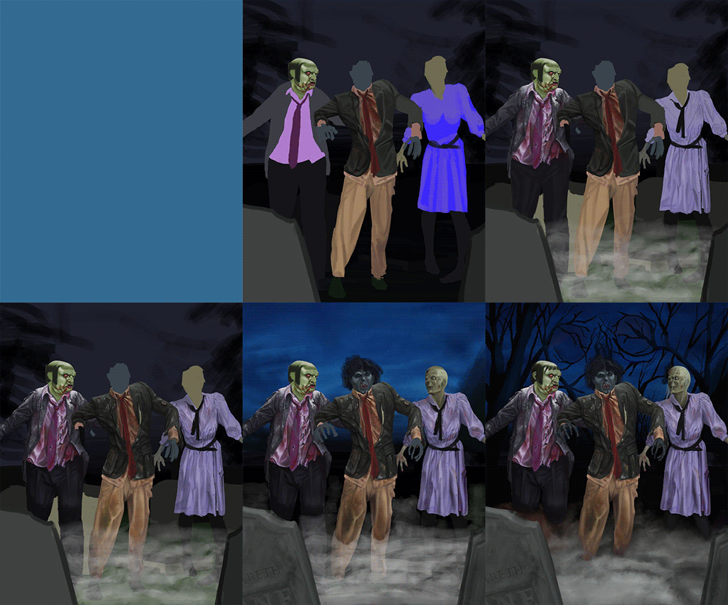
I kept each major element on it's own layer to save time, although that actually didn't work out as well as I'd hoped since the image was so big my PC choked on it and slowed down a lot. Still, it did allow for easier tweaks as I went along. Here you can see the development of the layout and the color scheme as well as the first pass on the the zombies. I had no idea what I wanted in the background at this point, other than "Trees", so that's a bit rough. These four images show the first bit of digital "trickery" as well - I resized the female zombie after first painting her so she didn't seem to loom over the one in front (the second time was resizing the lead zombies head later on, though I regret that in retrospect).


It was around the time of the first of these four images that my PC caught a virus and I managed to lose two hours of actual work as a result, plus about 8 hours of painting time while I cleared it off my system. Nasty business, and the lost time was primary in my deciding to simplify the image by losing the background graves and not including the comic title as I'd originally planned.

My compromise was to make the mist a lot thicker than originally intended, and to have the trees and clouds form a skull in the background. This latter was inspired by the Mondo Return of the Jedi Poster, which is extremely cool. I didn't look up their poster until I'd completed this, but I had a recollection of it from the first time I saw it last year.

The sky and the fog posed a minor problem, and I cheated a bit by painting them half size for speed's sake and then bringing them into the final picture and painting over the top for the final result. The gravestones are based on actual ones they use in their yard display, which I thought was a nice touch, though you can barely see the one on the right of the image.


Finally, here's a more detailed look at the painting of the female zombie (they name them, but I forget the names). I can probably do better than this, but not while rushing at the same time as capturing a 50's horror comic vibe. I was concerned that my compromises would not meet with Moby's approval, but I figure that based on the time I spent on it he'd probably got his money's worth regardless. I just hoped that the birthday girl would like it.

She did, thankfully. Liked it enough that I got invited to her birthday dinner where she and her family enthused about it at length. That was nice, and appreciated, although being a humble soul I found the whole thing a little awkward (I don't do that well with compliments, don't quite know how to take them, though they're always nice to have).

So yeah, I've not seen the final print as yet, but I'm told it looks pretty great and is really big and cast a shadow over all her other presents that day, so that's great. For myself I'm not completely happy - if I were to do it again I would change the composition slightly, moving the female zombie to the front (I think her light shade draws the eye more than the guy in brown), but given the time constraints and the reception I guess I should be quite pleased with myself. I know one thing, it was certainly an interesting experience ;)

Popular Posts