Sunday, July 29, 2012

Pay No Attention to That Man Behind the Speedpaints

Back once more with the monthly speedpaint roundup. A little different this month, but we'll get to that in a minute. I decided at the Blog's birthday to try doing at least one speedpaint a week for the year, and so far I've managed to keep to that; so I have another four for you to see.

In other related news I'm taking a break from doing the commissions for a little bit in order to focus on improvement. People still want them, and I'd like to do them, but I feel bad taking peoples hard earned when there's improvement to be had (plus, they're a lot of work), so on with that for a few weeks before the money raking (hah!) can continue.

I've also co-started a group at work dedicated to that very improvement. I'm very happy with the response so far as we have artist and non artist alike all wanting to improve. We're not doing lessons and such (so far), it's more like a Weight Watchers type setup where we all admit that we suck and give each other support to improve. Expect to see some of my results appearing in the blog in future - right now I'm drawing a page of circles every night for two weeks, I'm sure you can hardly wait to gaze upon those those now can you?

OK, enough preamble...


Time Taken: 1 hour

My friend took a photo of these peaks in the Gower (look it up) with her phone and then posted it to friendface. Naturally I jumped on it immediately and, with her permission, painted it. It's not an exact copy, but it's close enough, and it's been a while since I've painted anything landscape like. If I'd spent about another hour on it it could have looked really good I think (not planning to though).


Time Taken: 35 Minutes

San Diego Comic Con was this month, and appearing on the floor were the three trolls from The Hobbit which many people took photos of. I thought that might be fun to paint, so I had a go at it. For the fun of experimentation I used very thick paint (fake, in ArtRage, obviously) and a low load. The result isn't that great as just as I was getting into it something came up and I had to leave it and then I didn't get back to it in a timely manner. But I also grabbed this:


I realized that I could "rewind" the painting by using undo because ArtRage seems to have an infinite number of undo steps per session. I took the chance to do what I've rarely done before and grabbed some work in progress shots of a speedpaint. It's odd that these were saved after the fact, but nevertheless they give a little insight into my speedpainting process (Which I think varies a bit every time). I did this for the other paints this month too.


Time Taken: 45 Minutes

I guess I've had this flagged for painting for ages. It's based on Stock by the intriguingly named pretentioustwat on Deviantart. I was originally going to paint the whole thing, but after viewing it full size (which naturally didn't fit on the screen) I thought just this crop of it might work too. I also decided (experimenting again) to make dark blue the darkest it could go, rather than black. I quite like the result.


Which is not to say its as good as I would have liked. I messed up her hands something fierce, but I suppose it's good enough. 15 Minutes in I almost gave up on it as obviously no good could come of it, but I'm glad I kept on. Interestingly it was only when it was finished that I could take a step back and decide the lack of black (or at least near black) had worked. Until then I was convinced it would be far too obvious, but in the end result I don't think it is until you really take a good look at it.


Time Taken: 35 Minutes

This is by far my favorite paint of the month. It's far from perfect, but it has that loose look I really liked about the portrait of the man from the last speedpaint post, but with a more finished feel. It's loosely based on this photo, though I have no idea where that picture originates from unfortunately.

As an experiment I saved the undo series as a video and uploaded it. You don't get to see the actual settings used or the occasional mistakes I made (since they were undone during the process and therefor not recorded), but it's a lot less stressful than doing it real time (as I've done before).


And so there we have it for another month. I don't think I'll be posting progress pictures for speedpaints ever month, but if you think I should feel free to let me know. I'll may post them for paints I really like though, as that's possibly worth the effort.

Sunday, July 22, 2012

The Best and Worst Sketching of May and June

This one's rather late in coming, and for that I apologize (you're used to it by now I'm sure).

Since I last posted I've had another virus infect my machine, I've upgraded windows and re-installed twice (partly due to the virus), gone deaf in one ear due to allergies (which cleared up - but now it's happened to the other ear) and discovered my scanner no longer works (Windows 7 incompatible, there's nothing actually wrong with the scanner itself). There was probably some other stuff in there too, but if I don't remember it it's probably not important.

Thankfully I had the good sense to scan sketches before that first re-install, so I do in fact have something to show today.


 Figure and Perspective Practice

I really need to work on my anatomy properly soon (and I'm taking steps to make that more likely to happen - but more on that some other time). It's improving, and I have a general idea of it, but I regularly forget some of it when I most need to remember (mostly on arms) and other parts I have very little knowledge of at all (legs). Still, some of this turned out okay.

I particularly like how the girl in the lower middle turned out, as well as the guy in the upper right corner. Other than that, fairly average stuff.


Free Sketching

Lots of free sketching this time around - much more than I would have expected, but I guess if you post two months worth at once that's what you get.

Not much to comment on except that I think the sketches in #1 are far better than in #2. And yes, that is a chainsaw; it's a prelim for a work I'll probably never get around to painting (but there again, I might.

Focus Sketching

I didn't really have a focus during these two months, but I did draw more hands than usual. Many of them are attached to people and can be seen in the other images, but this is a small selection of free floating ones. Still bad, but improving.


Work From Reference

Not a great deal given the time period. I need to set some time aside to do this more often - they're rarely very large and don't tend to take long when they're at this level.

Anyway, I had a link to the image the first one is based on, but it got nuked by the virus. If I find it again I'll add the link here. The guy with the hair is based on this image by Random Acts

I don't recall where the other two came from, just random images on the web I think.


Oh Dear

And as usual I'm finishing on a low note with some of the worst (as in, most disappointing) sketching of the time period. I really don't have much to say about these - they sort of speak for themselves (admittedly spattering you with phlegm as they do so).

Anyway, hopefully less of a delay before the next post. I have some speedpaints lined up to show, and a new scanner is winging it's way across the country to me so I can scan this months sketches for next months post. Whoopie.

Tuesday, July 3, 2012

Children of the Apocalypse

Despite the title of this post it should be noted that the two boys in the picture that follow are actually lovely lads.  The reason for the title is something that's not even apparent in the images, yet it's been the planned title ever since I got the commission for it back in April.

So why was it always the planned title?  Because the original brief required the two boys to be standing in front of a nuclear explosion with an innocent look on their face.  The idea was that they unintentionally bring chaos and destruction with them wherever they go.  They're boys, this is standard operating procedure :)

Okay, let's get to the chase and we can review afterwards.


Click to zoom, and so on....  Note the lack of an apocalyptic backdrop.

So I was at work one day and my colleague 'Z' comes by my desk.  I like Z, he's a good guy, with a laugh that's in the top three most awesome I've ever heard (and by far the loudest).  Despite this we work in very different areas, so for him to come by my desk is a rarity.  He cut straight to the chase, which is nice.

"Do you do commissions?"

"Not generally, but I could I guess" (This was before I got two others)

And so I got my first paying gig as a 'painter'.  Cool. I explained that I could only do digital (I can do real media of course, but I wouldn't charge for the resulting rubbish as yet), and I'd let him know the price as soon as I'd thought about it.  Then he laid out the whole "Kids in front of an explosion" theme.  How could I resist that?

We settled on a price (which he felt was too little, but I didn't want to charge more without being able to guarantee an awesome result), and set a date for me to come over for a photoshoot.  This makes it sound far grander than it actually was, given the rundown Cannon point and shoot I would be using, but I felt it important to get reasonable quality images and to meet the subjects.

Well, the date fell through, then it fell through again, and again.  On the fourth attempt I finally managed to get together with them for the photos.  Sadly after a run of lovely weather (the sunny look of which would be perfect for the atomic theme) it was dismal that day.   Never mind, I can still take photos.

Then it turned out that Z had either forgotten to mention the big boom to his wife, or it had been forgotten in the huge gap between the concept and my moving on it.  There was some discussion, but no decision - so I hedged my bets and got photos suitable for both likely scenarios.  I took more supporting innocent expressions and "It's his fault" poses than brotherly love, which turned out to be a mistake when the final decision went that way after all.  So between that and my terrible skills as a photographer these were the two usable photographs I had to work from:


I preferred the closeness in the right hand one, but the eldest's (R's) eyes are closed and I felt the hand in pocket pose of the one on the left better captured his personality.  I decided to merge the two, extrapolate R's eyes and move his arm from the youngest's (L's) shoulders to around his waist  to make it seem cosier (which would also hide the cast he was wearing).  Time to get sketching.


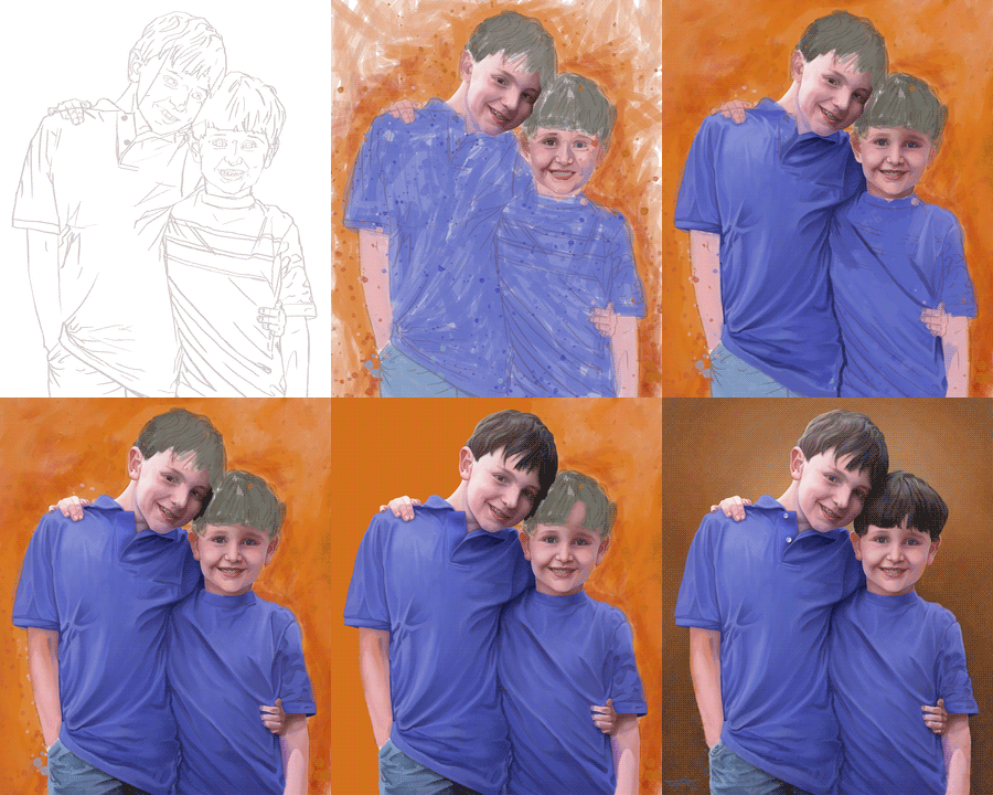
So I should make it clear that I didn't just magically sketch the initial lineart with extreme accuracy.  Since I wanted to get this right I used a grid to get the rough proportions down, as well as the locations of the features, then I drew over the top of my rough layout; you can see the line running down R's face - I put that one on the wrong layer.  I won't bother showing you the layout one as it's all stuff like that - seemingly random lines floating in space, and that's boring (mind you, if you're still reading maybe boredom isn't an issue).

After that I painted a rough colour layout and flattened the whole thing down.  You'll observe the background is chaotic orange - this is because in my head it's still an explosion, and I found it hard to let go of the initial vision I'd had for the piece.

I threw another layer on top and started painting R's face.  I should point out that with the exception of a mask layer you'll see later on these were the only two layers I used.  I got around the ArtRage issue I've had in the past with opposing colours by changing the way the paint mixing works in the preferences.  I didn't even know I could do that until I painted the zombie piece last month.  So, in the last image above I've taken R's face to a rough first pass and started on L's.  I'm not happy with R's eye and L looks a bit like the Joker. Clearly a long way to go then.


Not all that much to cover here.  The first two show the completion of the first pass on their faces and my starting their t-shirts.  T-shirts are boring to talk about, although you'll note they're blue rather than the red in the photo  (I forgot to mention this before).  This had some repercussions as the red of their shirts is reflected on their skin in the photos, so I had to substitute for blue instead, which makes a surprisingly big difference.  I also decided to lose the stripes on L's shirt at this point, better to unify them, and also because of a concern that the lines would pull the attention away from their faces (one of the reasons I switched from Red to blue in the first place - red is more eye catching).

In the lower left image you can see I've started to paint the background in solid orange.  This isn't actually part of the painting but is on it's own layer as the basis of a mask later on - I left it orange so it wasn't  too distracting while painting.  At around this point I got some feedback letting me know that it was felt R's nose was a bit pointy, so I took that as an indicator I needed to rework his face some.  I fixed his nose and his eyes and changed the shape of his face a little and did some blending, which I've also started on L's face in the lower right image.


Onto the final stretch.

Initially I gave into stupidity instead of taking my eye's word for things and painted R's hair dark brown, because it is.  Afterward though it looked all wrong, so I took a step back and reviewed the photograph, noting that the light made it almost appear light grey, so I repainted it.  I don't have an image of the brown for you as it's not worth spending your time on (and I spent quite enough of mine on it), so here you see the repaint. with the result (and the start of L's hair) on the top left, along with my completion of the mask.

For the final background I painted over the orange chaos using the mask to protect the image of the boys - I've let the initial background show through a little for texture  as well as adding a little mottling into it.  You'll notice in the gif below that it started out more yellow - but that just wasn't working out for me (and I felt the result looked to much like a previous commission) so I switched it to brown. You may not notice much of a difference between the lower left and lower right images, but other than signing it I've also done some cleanup of their hairlines, finished R's jeans, tweaked the hands, and added a little "chaos" to the bottom of the image for visual interest.

And there you have it.  Those familiar with the blog know it's pretty rare that I blow my own trumpet, and rather than change that I'll late Z speak for me, from his facebook posts regarding the image:

"So this is what happens when you ask a fantastic artist to do a portrait of your sons. I am so happy right now.
Stuff like this never ceases to amaze me. I couldn't do accurate stick figures of my boys and I've known them, well, their entire life. James not only got their look but their personality. HOW?"

Well, now you know the how ;)

(You might need to right click this image ans reload it to see the animation... then again, you might not)

Popular Posts