Monday, January 31, 2011

Social Profiling № 3: Larry

If you've strolled into this post you can see what it's all about, and the previous related entries here (for Owain) and here (for Steve). OK, so hopefully everyone's now on the same page. Good.

I was hoping to get this posted about an hour ago, so it would count as an extra post for January, but sadly poor old January is now going to miss out on it due to a series of cockups. Actually only one cockup was responsible for the post's delay, the other two probably saved it from being even later (one was the loss of over an hours progress in New Vegas. Most upset about that I was).

Anyway, enough about all that rubbish. Hold on to your hats, it's time for Larry.


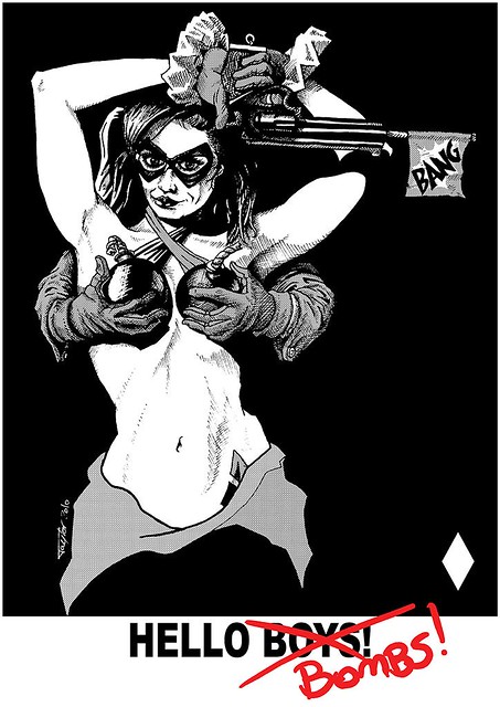
And there we go. Clicking the image will bring it up to eyeball searing dimensions, as usual.

Now Larry was an interesting one to do because I don't know him from Adam's (That's an in-joke kids, don't worry if you don't get it). He's the only facebook friend I have that I've never met in the flesh at least once. Why is he my facebook friend? Because I'm friends with his Brother and his brother commented on a picture of Captain America I did (You can see it here). So Larry saw the comment, and thus the pic and decided he wanted to be friends with me. Fine with me, but it does mean that everything I know about Larry is what's up on facebook, plus a little his brother's said about him.

So, I went and had a look at his photo's to see if I could find one that sparked something, and found this:


I liked that. I liked the juxtaposition of the serious looking Larry with the Hello Kitty rings. But just copying that wasn't good enough for me - oh no, certainly not. Larry's posture put me in mind of a certain Marvel comicbook character. He's not all that well known, goes by the moniker of "Wolverine" or something... I figured that since he'd become my friend over one Marvel character he'd probably quite like the other*.  Anyway, for that to work well. I'd have to shave a few pounds off, add some more hair and hope to heaven that it still looked remotely like him afterwards.

Here's the step by step - More words afterwards.


So as you can probably tell this one was done partly "for real" in that I started out on paper.  I felt this was probably the best way to get a real comic strip look to it.  I grabbed a photo of my hand in the same position as Larry's, but in a fist, and then started sketching.  Once I'd done that I scanned it, so if I fluffed the next bit I could still ink it in ArtRage.  Decided the Hello Kitty thing needed to be kept, but I expanded on it by adding the cork and the fry to the other claws (the cork is of course a reference to Dirty Rotten Scoundrels) , and the fry is just something you might find on an actual three pronged utensil - though in retrospect it should have been a hot dog.

Once I was happy with the pencils I moved on to inking.  I went out of my way to make the inking rougher than I usually do it as I felt the looser style would work better in this case.  That's not to say I rushed it though... well, I rushed the claws because I couldn't find my French Curves (like a ruler, but curvy), but that came back to bite me.  Inks looked good, onward to Photoshop; via my scanner.

The 3rd picture is the Photoshop cleanup I did. As you can see I cleaned up the claws - which ended up taking longer than the inking did (with the French Curves I could have done it far faster, but I still don't know where they are).  I also added a highlight to his eyes and removed some of the shadow from his top lip.  I could have done this on the original, but it didn't occur to me until I was in Photoshop.

Then, for picture number 4, I took the cleaned up inks into ArtRage for colouring.  I sort of wish I'd not added the darker colours to his arm now as I don't like the result, but at the time I was happy with it.  Not much else to say about the colouring really - I used the Blue and Yellow from the foreground image, and intended to use them in a way that pushed the eye onto Larry's face as I found with the black and white version my eyes tended to stray to his ear.  at first the colours were the other way aroud, but I found that by placing the yellow on the right my eyes would move over to the left - I have no idea why, but it was an interesting discovery. Hmmm, I guess I did have a bit else to say about the colouring after all.

Finally I took the coloured image back into Photoshop to degrade it some what. The intention was to get a late 80's/early 90's comic strip look, and I think I succeeded.  The techniques used in the aging process were almost identical to those used in my Nick Fury picture, and my brother's Iron Giant card, but I discovered that by scanning tissue that's been crumpled and flattened you get a much better paper texture for use as an overlay, which was quite useful.

And that's all there is to it.  I'm still not sure if it's a good likeness, but Larry's brother Wayne was the first commenter on the facebook posting of it (consisting mostly of "hahahahaha") and Larry said it was "Awesome" and made it his profile pic immediately.  Score one for me (horrah!).

One more to go, and I do believe it'll be the toughest of the lot.  I may have another post before I get to that one though, so until the next time,

Exelsior!

 *I really should get around to doing a DC character one of these days.

Sunday, January 30, 2011

Social Profiling № 2: Steve

Quick recap: Painting four profile pics for four of my Facebook friends.  You can see the first here; along with a better explanation. This is the second.

Since that first post I've managed to crank out the third in the series, but I'm still only at the point of writing up the second.  Will I get the third written up tonight? Unlikely, but possibly tomorrow (more likely next week).  But what of the second? The one of Steve? The one I'm supposed to be talking writing about now?   Well, if you'll stop interrupting we'll get to see it.

Okay? All done with the fidgeting? Good, let's get to the pic.


Click the pic to increase it's largitude.

So I've know Steve a few years, and up until recently he was a colleague of mine at work; we even shared an office for a few months. As a result of this I have a reasonable handle Steve's personality. This time I learned from what I felt was a mistake on Owain's and tried to make the profile pic fit the person, with the likeness being of secondary importance.

The first step was to go through the photos available to me on facebook. This did not take long as I found the photo below and just stopped there.


Really, what could top that? As it happens Steve is a musician (and actor) not a Chef, but this photo caught the perfect facial expression and level of humour. It reminded me of the Swedish chef from the Muppets. Now, throw in that Steve, as a musician, has a banjo he's very fond of, mix it all together and what else can you do?

Is it a good likeness of Steve? For being a muppet sure.  I'm actually not happy with the stance more than the face - the photo has him standing back and proud, while I've painted him slightly hunched.  It works, but it's not quite what I was going for.  Additionally his hat looks very rough.  in retrospect I should have spent more time on it.  Y'know what though? I could nit-pick my own work for hours. You know this, I know this, let's call the whole thing off...  No, hang on...  Here's the step by step (enlargeable this time):


You'll note that Steve's nose changes a few times in there. In the end I felt that having a human shaped nose was just kinda creepy, so I swapped it for a regular muppet nose after some other tests. Oh, and that is Steve's actual banjo Kermit is playing (though not to scale) - it seemed pretty apt to do that, but I think it took as long to paint as the rest of the image combined and it's still not quite right.

Steve seemed to like it, but didn't use it as his profile pic - that's A-OK by me.

Saturday, January 29, 2011

Social Profiling № 1: Owain

Back at the start of the month there was a thing going around on Facebook. People would post something along the lines of "Paying it forward 2011. I will give something handmade by me to the first 4 people who reply, on condition that they repeat this message and do the same for their first 4 respondents." This popped up all over the place like a rather smelly chain letter, and struck me as being a bit, well, naff.

So I did my own which read "Who wants me to paint them a profile picture? I'll do four, two for the UK, two for the States if anyone wants one. There's a catch though - I get to pick the picture, and I can't guarantee it'll be any good. ;)
Anyone game? I'll do them over the next week or two (and unlike that paying it forward thing you don't have to do anything, not even use the picture if you hate it)."

I got 16 responses out of 140 friends. I don't know if that's good or not. Anyway, it's taken more than a couple of weeks, and I've only got two finished. I was going to speed paint them, but they ended up taking a bit longer each, and as a result they each get a post of their own. I randomly picked 4 of the respondents to do profile pics for (and it really was as random as I could make it) and started from the top of the resulting list of 4; my old chum Owain.


Clicking the image will make it rather larger.

I've known Owain for about 18 years, meeting him when he was a mere 16 years old. We had a lot of good times as part of a larger group, including making several very silly but extremely fun short films and taking our first trips to the US together in Florida where he turned 18 (coincidentally, one of the other profile pics I'll be doing was of Annette, who also came on that trip, and who also turned 18 while we were there).

After college we fell out of touch. We kept in contact by mail for a few years, and many was the time my day was brightened by a witty missive from the "Blonde Toss" as we called him back then, but the writing both ways dried up and I hadn't seen him or heard from him in about 12 years. Facebook has restored the connection to a degree, and I'm happy to say he hasn't changed all that much from what I can gather from his posts (this is a good thing).

So, enough background, how about the picture? Well, it's a failure I'm sorry to say. Oh, it's a perfectly good portrait for itself - it looks quite a bit like him - but it fails to capture him as it were. It's a good portrait of his physical presence, but not of his inner being. If it had been more graphic, or art deco (which is pretty graphic anyway) or done in the style of a good movie poster, or even just extremely silly, then I think it may have been more successful. Still, fail as a profile pic, win as a likeness, how's that?

I've asked him for permission to post the photo it's based on, but he hasn't responded yet so I'll leave a space here for when he gets back to me:

[SPACE FOR OWAIN'S PHOTO)


OK, photo permissions supplied, so here's what it was based on:


And here's the step by step.


Owain was in New York for his wedding by the way, he actually lives in Swansea, but having the Empire State building in the image was something that just worked for me, so there it is. I think the whole thing took 5 or 6 hours, though I really don't know why as it's sort of rough.

Not much else to say really. I hope to meet up with him next time I'm in the UK, but since I'm notoriously lazy about staying in touch, and he's not fond of pubs (Unless that's changed) I give it a 40% chance of occurring. Time alone will tell.

Cold in the Lazy Bones

By my reckoning it has been about three weeks since I posted anything. This isn't very good at all. In my pathetic defense there was a week in there where the entire household got sick, but this is sort of offset by much of my time being taken up with playing video games. Fallout: New Vegas and Little Big Planet 2 are both sink-holes for time, and it's easy to lose track until you realise it's too late to do what you actually mean to do, such as draw, or update the blog.  All that still leaves a week unaccounted for... perhaps I dropped it down the back of the couch...

As a result I've not only not posted, but I haven't done much in the way or art either. Oh, I've done a little sketching, which I'll cover here, and I've done two ArtRage paintings that I'll cover shortly, and some speed paints, but not a lot in comparison to previous months, and very little in the way of actually improving. I really need to get on with it or I'll never be any good. Anyway, on to the feeble number of sketches done this month.


OK, to be fair I have done slightly more than this, but these are the best and the worse. Not only that but they're a mix of referenced and "out of my head" doodling. I didn't do enough of anything to make it worth breaking them up into other images. I'll let you decide which are the best and which are the worst - This month I honestly can't decide myself.

That's it, move along.  I'll try to get another post with something fractionally more exciting in it done soon.

Thursday, January 6, 2011

Why so Blue?

I've been meaning to paint a picture of my son for quite some time, and I'm really not sure why it took me so long to get around to it. I have lots of photos of him, some of them adorable, and I've done some sketches of him (of dubious quality) that you can see throughout the sketch posts of the blog. So why now? I really don't know, but I took a photo of him while we were out sledding that I just needed to paint. Terrible Father that I am; he was sad because the snow sprayed all over him when we came to a stop, and I snapped a picture; I did give him a big hug afterward though.

So I had my picture, but now how to do it. I could do a pencil illustration, or charcoal (because that worked so well last time right?), or pen and ink, but this one needed to be painted as it was partly the colour that drew me to it. Not a speed paint either (though still in ArtRage), something a little more challenging. You can see the results, and my challenges, after you click more (assuming you're not already reading the expanded post).


You can see a somewhat larger version by clicking on it as usual.

So what were the particular challenges to this one? Well, first of all I decided I was getting far to comfortable using pretty much just the oil paint tool. Yes, I have tried the watercolor tool here and there, and the pencil tool, and the roller (If you know nothing of digital painting or this otherwise means nothing to you that's OK). Anyway, I decided to paint this using the roller minimally, and the pencil, watercolor and oil paint tools not at all. This forced me to try new techniques.

The second challenge was that I decided to do it all on one layer. I failed at this, but only just. The initial sketch is on one layer (think of it as a projection), and the snow that's fallen on him is on a third layer. Mostly this is because the technique I was using for that has a fair amount of randomness to it and I wanted to be able to easily erase wayward spots.

Oh, and I didn't sample any colours from the photograph - I had to pick them by eye.  I think I did a pretty reasonable job of that this time.

So we'll get through the rest of this quickly because I want to go to bed tonight. First of all, here's the photo that inspired it, and the sketch that the resulting image came from.


If you're paying attention you'll see some differences, such as his hands being to big in the sketch, there being less perspective, and his head being at a different angle (he's also missing a finger).  I could have fixed those issues, but at the time I thought the match was good enough to start painting (in retrospect I wish I'd spent a little longer on it, ah well).

So I did start painting, and here we have a nice animated gif of the process.


I was going to capture the process to create a timelapse video, but I'm glad I didn't as this was done over several sessions and took quite a while. I don't know exactly how long, but at least 5 hours, so a video of it would take a while even when sped up. So you get the multiple saves I did for the purpose condensed into a gif.

I started off painting using art markers to paint his face and coat, and that is predominantly the tool used for those all the way through, as well as for his hands. For his hat though it was going to be difficult to get the woolly effect that I wanted using the markers, so I laid down the base colours with the art markers and then switched to using chalk and crayon for the pattern. This had the advantage of picking up the grain of the canvas, which looked enough like knit to suit my purposes. I still had to paint the stitches of the pattern individually, but it still saved a lot of time. I used a similar technique on his bobble, and then smeared it with the palette knife to get the furry result.

The initial snow pass on his hat was done with the spatter sticker brush I had previously created for this image back in September, and that I also used when painting this picture of The Doctor. Nice to have made more use of it since it took a while to create. Other snow layers were built up with the chalk tool and a new variation of the spatter brush that's a lot finer.

Finally I went over the whole image with the airbrush tool, just to add a little more definition to his face, add some light bleed around the edges, tidy up some blending issues on his coat and paint the background. This made a lot of difference to the finished image, even though I only spent a short while on the pass.

Now, I've had quite a few compliments on this one already, more than I would usually get, and I have a few theories about that.  I'm not sure that it's appreciably better than much of my other stuff, but it doesn't involve guns, swords, shields, vampires, zombies, dinosaurs, scantily clad women or grimacing men.  It's just a little boy looking sad in the snow, and I think people respond to that who usually wouldn't even click on the thumbnail.  "Awww, poor dab, how sweet," they think, "I like this!" they say, because they had an emotional connection they otherwise wouldn't get.  Food for thought there...  Or possibly just food for the mouth in the top of my hat that doesn't know when to stay shut.

Saturday, January 1, 2011

Blart #12: Harley Sees the Year Out With a Bang

Happy new year!  Here's hoping that it's a lot better than last year.  Not that there was much wrong with last year, but there wasn't much right with it either.  Ultimately, for a year with as cool a number as 2010 it was pretty bland and forgettable.  I had a close friend lose their job, a close friend of the family died, and we discovered that the majority of the windows in the house need replacing as they're rotten through and through (There were other things, but you don't get to hear them) On the plus side we got a new fridge, my wife found a hobby she's pretty good at (again - she's good at everything), and my best friend had a son (well, he didn't, but his fiancée is pretty wonderful too) .  I drew a bit.  OK, I drew a lot.

It seemed to me that I should finish the year where I write 2010; or 2k10 as was also done; after my signature with a piece of work that was started, but up until now not finished.  It was the next Blart along from Wolverine; Harley Quinn of Batman infamy.  I should point out at this point that the name I use on this blog has nothing to do with her, and my use of it predates the character by 3 years.  One day I'll cover where the moniker came from, but today is not that day.  Right now we're discussing Harley Quinn:

Blart #12 - Harley Quinn

So, there you have it, my first finished pen and ink illustration since the last one. I'm honestly not sure if I like the result or not. In fact I actually prefer how it looked at an earlier stage (Which you can see below). It doesn't really look like it did in my head, but I like it enough that I might do it again at some point with paints (fake ArtrRage paints in all likelihood).

Would you like to see the blow by blow of it's creation? I really don't care if you do or not, I'm still writing one. If you honestly don't want to read it I won't hold it against you if you duck out now. Off you go, the rest of us will be fine without you.

So the inspiration for this obviously comes primarily from the subject of the Blart, with references to Janet Jackson (this album cover) and old Wonderbra advertisements.

Pretty early on the idea of holding cartoon bombs; actually early grenades; in front of her breasts came to mind - She's quite often depicted with a cartoon style arsenal. Here are some early sketches (actually, these are all the preliminaries I did that are clearly related, though I did more you've already seen that didn't visually have any apparent link.


The first of these - The one at the bottom where she's kneeling - was done back in September, so the idea's been floating around a while. The last of them, on the right, was done in early November.  The one where she's topless didn't start out as a Harley Quinn picture, but after I'd drawn it it seemed like it would be a good fit,  so I added the pigtails. That's where the pose came from, which eventually led to the idea of someone else holding the bombs and harking back to the Janet Jackson "HandBra" image. I should mention that that is the best sketch I've ever done without reference of any kind; I think it's pretty good.  The one on the right had a small amount of reference for the hands and gun.  That sketch led to the following.


Yes, that's a grid you see behind her - I had the notion of using a real model as reference for her waist/torso/breast/head ratio, using the grid to make sure everything was the right size. I wasn't happy with the result (although when it's small like this it looks better than I remembered). And there I stopped - I wasn't happy with it, so I just left it in the "I'll get back to this" pile, where it sat until Wednesday night when I opened up the sketchbook and started sketching over the top of the last one. In between the sketch in November and Wednesday I had the idea of the Joker's hands holding the bombs, so I got some reference shots of me wearing rubber gloves and holding one of my son's soccer-balls (I had to phrase that carefully). I'd have been better off without the gloves it turned out. Anyway, this was the result:


Which I sort of love, even though in retrospect I drew Harley's hand far larger than I did the Joker's. I just noticed that, drat. I added the "Bang" flag coming off the gun because, well, it's the sort of thing she does :)

So after that I started inking... Not much else to say there. Here's an in progress followed by the finished inked work:


The finished one is enlargeable, and to be honest I like it a lot more than the way it turned out after I scanned it in and added the black background and halftone shading.  You'll note I got lazy and didn't finish the folds of the cloth from her half removed cat-suit - if I ever revisit this I'll add them in, but I never found a good reference for it, and my wife doesn't posses a cat-suit to model one (mores the pity...).  And revisit it I may, I think this might work really well painted, but painting takes a bit longer than inking (which takes long enough), and I wanted this one to be the last piece of 2010, which it is.

So, have a great year, I hope your hangover isn't too dreadful :)

Popular Posts